


Have you ever wondered how some beautiful animations on the web are made, then assumed it was done by a far more experienced and skilled person, and then abandoned your plans to recreate it?
Usually, vanilla CSS is used to create these mesmerizing designs, not some animation library. This article will look at how to make some mesmerizing designs, starting with small practical examples and working our way to creating a highly aesthetic profile card to further elaborate on the actual ability of pseudo-selectors.
Prerequisites
Before we elucidate our topic of interest, we need to get familiar with some essential web development tools and knowledge required to follow along.
- Fundamental knowledge of HTML
- Fundamental knowledge of CSS
- A Code editor and a browser
What are Pseudo-elements?
Pseudo-elements are CSS selectors that add a whole new HTML element into the markup. They tend to add content or decorate our webpage without creating additional HTML tags. We declare these elements with the double colon as a prefix (i.e., ::before). This article will dwell on the ::before and ::after pseudo-elements to understand how we can use them to create fantastic animations and transitions.
However, there is a common misconception associated with pseudo-elements. Pseudo-elements are sometimes mistaken as pseudo-classes, however, there is a slight variation. A pseudo-class selects elements that exist in a specific state and often applies some styling to it, and sometimes to prevent excessive use of CSS classes when targeting specific elements to promote cleaner HTML code. They are declared with the single colon as a prefix (i.e., :hover). Some examples of pseudo-classes include: :hover, :first-child, :first-letter.
## Pseudo-elements overview
The ::before pseudo-element
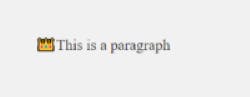
As the name implies, the function of the ::before pseudo-element is to add content before the element's content.
<p> This is a paragraph </p>
p::before { content: "👑"; }
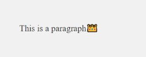
### The ::after pseudo-element
Also, as the name implies, the function of the ::after pseudo-element is to add content after the elements’ content.
<p> This is a paragraph </p>
p::after { content: "👑"; }
CSS Properties applied with the Pseudo-elements
Preliminary to diving into building our main attraction (profile card) of this article, let’s take a little detour and first explain some CSS properties we’ll be using for design and customization.
- Positioning
- Relative
- Absolute
- Z-index
- Transform
- Transition
A brief intro to CSS Positioning and Z-index
Before using these properties to build our final project, it is important to highlight their behaviours.
Positioning in CSS
The position property of an element specifies the type of positioning the element should have in the document or page. In CSS, there are several positioning properties such as fixed, sticky, absolute, relative, and sticky, but we’ll only go through relative and absolute in this article.
Relative Positioning
Setting an element’s position property relative sets the element according to the normal document flow. An offset can then be selected based on top, right, bottom, and left.
An example would be:
<body>
    <div class="box-1">Normal Flow</div>
    <div class="box-2">Offset Flow</div>
</body>
.box-1 {
  background: #333;
}
.box-2 {
  position: relative;
  left: 120px;
  background: #999;
  top: 0;
}
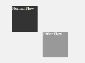
As shown above, .box-2 moves 120px away from its natural alignment, yet other surrounding elements observe its vacated space.
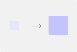
Absolute Positioning
On the contrary, setting an element’s position property to absolute pulls the element out of its natural document flow. It tethers that element to its immediate parent, whose position property is set to relative. If no relative parent of the absolutely positioned element is available, it is tethered to the body element (i,e., root relative parent element). It is important to note that absolutely positioned elements have a higher stacking order than relative elements and are placed above every relative element they intersect.
An example would be:
<body>
  <div class="container">
    <div class="box-1"></div>
    <div class="box-2"></div>
  </div>
</body>
.container {
        position: relative;
        width: 300px;
        height: 200px;
        border: 2px solid #888;
  }

  .box-1 {
        position: absolute;
        left: 20px;
        top: 20px;
        width: 50px;
        height: 50px;
        background: lavender;
   }

   .box-2 {
        position: absolute;
        left: 200px;
        top: 70px;
        width: 50px;
        height: 50px;
        background: aqua;
    }
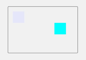
As expected, both boxes are tethered and use their parent element (.container) as a reference point of alignment when the position coordinates are provided.
Z-index and CSS elements stacking order
First off, the stacking order describes the arrangement of HTML elements in the z-axis, i.e., how elements are arranged when stacked on top of each other (which comes before the other). Naturally, HTML elements are positioned in the following order:
- Root element.
- Non-positioned elements in the order they’re defined (i.e., elements without a position property defined).
- Positioned elements in the order they’re defined.
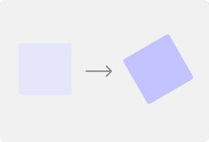
The Z-index property
This property lets us stack elements on each other depending on their increasing number of z-index. An element with a higher z-index property value will appear on top of all other elements with a lower z-index value.
A visual example would be:
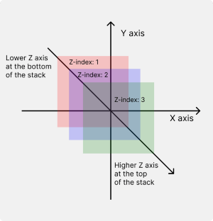
It is worth remembering that the z-index property only works on elements whose position properties have been set. Also, if two elements have the same z-index, the element created further down the HTML document stays over the previous element.
The Transform and Transition property
The CSS transform property comprises a series of preset functions such as;
- Translate(): This property repositions an element in a horizontal and/or vertical direction(s).
div {
    background: #c3c3ff;
    width: 30px;
    height: 30px;
}
.box-1 { transform: translateX(30px); }
.box-2 { transform: translate(30px); }
- Rotate(): This property rotates an element without deforming it around a fixed point in the 2D plane.
.box-1 { transform: rotate(30deg); }
- Scale(): This property resizes a 2D plane element.
.box-1 { transform: scale(2); }
Skew(): This property skews a 2D plane element. Skew means a slight tilt in a particular direction or to a certain angle.
.box-1 { transform: skewX(30deg); }
Lastly, the CSS transition function allows you to define the transition of an element between different states. After acclimatizing with some of the basics, let’s dive into our starter project.
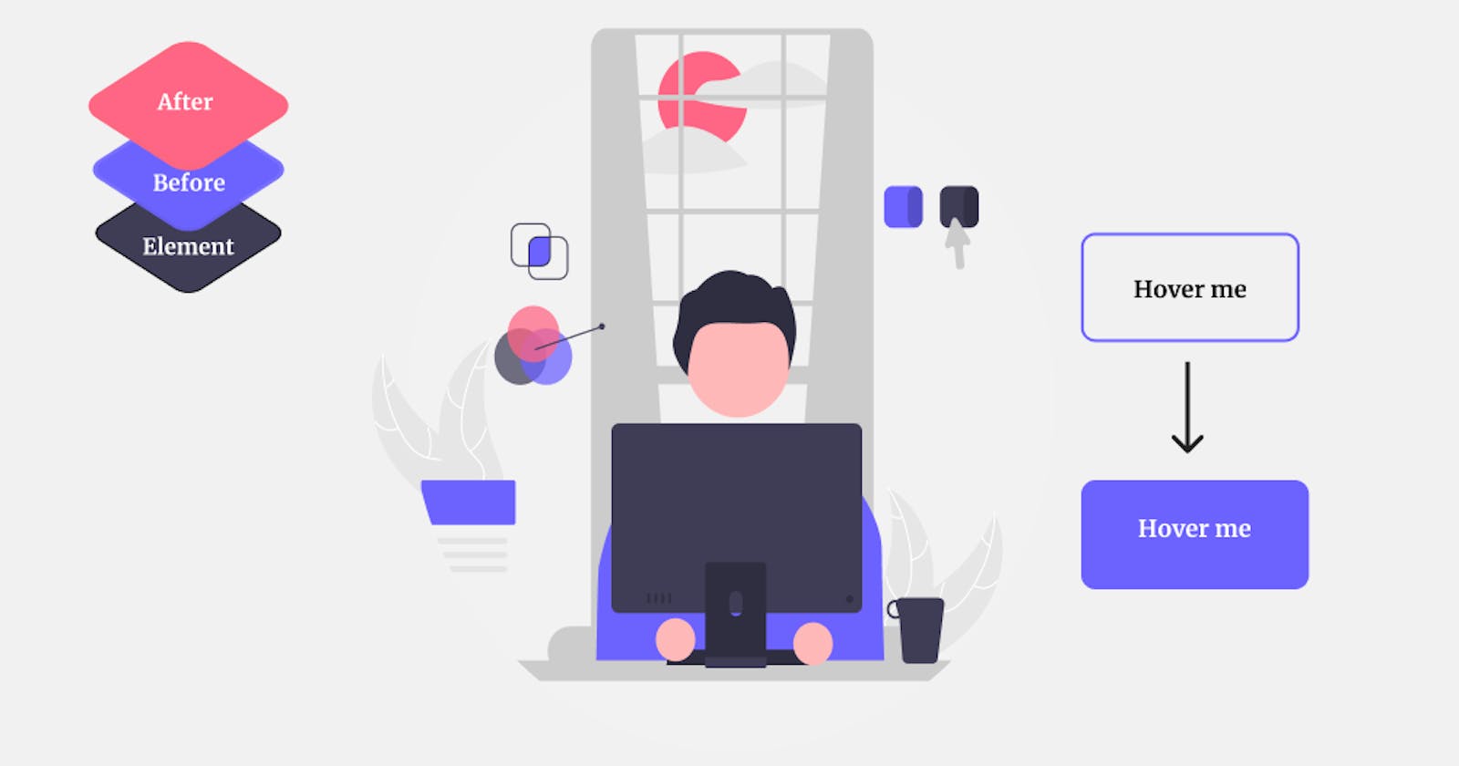
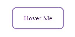
Building an animated button with CSS pseudo-elements
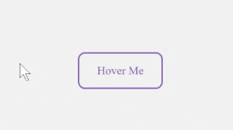
We start by creating a button element using the HTML link syntax
<a href="#" class="btn"> Hover Me </a>
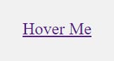
Then adding some basic CSS:
a {
  padding: 15px 25px;
  border: 2px solid #926ec6;
  border-radius: 10px;
  text-decoration: none;
  position: relative;
}
This is easy code; we applied padding to create spacing around our button’s text. Then added borders to it and rounded off those borders using the border-radius property. Next, we removed the default underlining displayed as we created the element (i.e., the underlining that comes with all a tags). Finally, we added a position property of relative since we’re making a child pseudo-element and need to tether it to its parent (the a element).
Now, we create our pseudo-element from the parent element and style that.
a::before {
  position: absolute;
  content: "";
  top: 0;
  left: 0;
  width: 100%;
  height: 100%;
  background-color: #926ec6;
  transition-property: all;
  transition-timing-function: ease-in;
  transition-duration: 0.3;
}
We first set the position property to absolute. This lifts the pseudo-element from its natural stacking order and attaches it to its relative parent element (the a tag). We also set the content to an empty set of quotation marks (“ ”), since we aren’t adding any content to the parent element. Then using offset values, we set the absolutely positioned element’s bearings to the top left part of its parent element (i.e., top:0, left: 0). Finally, we spanned the absolutely positioned element its parent height and width (i.e., width: 100%, height: 100%), added a background colour and some transition properties for smooth animation.
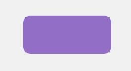
It looks like we’ve messed up our button, doesn’t it 😅? Well, don’t fright, we meant to do this, and we’ll modify it in a second. For clarity, the pseudo-element we created is currently laying over our button. We then translate the pseudo-element we’ve created by its full height upwards along the Y-axis to reveal our initial button.
a::before {
  transform: translateY(-100%);
}
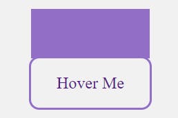
Then we apply the pseudo-class :hover to the parent element and animate the tethered pseudo-element based on the :hover behaviour.
a:hover::before {
  transform: translateY(0);
}
And viola!, we have this really cool animation done with pure CSS.
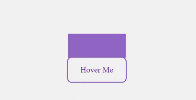
We’re left with changing the colour of the text to make it visible on hover and this can easily be achieved with the code below.
a::before { z-index: -1; }

a:hover {
  transition-property: all;
  transition-timing-function: ease-in;
  transition-delay: 0.5s;
  transition-duration: 0.1s;
  color: #fff;
}
To explain the code above. First, we reduced the z-index of the pseudo-element, which moves the pseudo-element behind its parent element, and hence makes the parent element always stay on top. We then added similar transition function properties to the parent element, with the variation being the transition delay, which in my opinion, adds a smoother effect. This delays the parent element’s animation after the pseudo-element has finished animating. Finally, we changed the colour of the text in the parent element to make the text visible and finish our animation.
Now, we only need to remove the overflowing bits produced by the pseudo-element to leave this beautifully rounded button. We can quickly achieve this using the overflow function, which hides any overflowing content.
Implementing this function looks something like this:
a:{ overflow: hidden; }
And finally, we have:
Creating an advanced aesthetic card with multiple pseudo-elements.
Now comes the big show. We're building a more complex animated card using multiple pseudo-elements—two to be exact—to create a stunning origami-looking effect. Without further ado, let's dive into the HTML mockup.
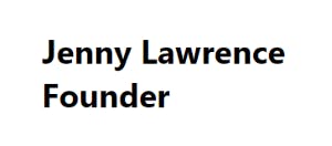
<body>
    <div class="card">
      <div class="img-box"></div>
      <div class="details">
        <h2>Jenny Lawrence <br /><span>Founder</span></h2>
      </div>
    </div>
</body>
We created a parent class named card and nested two child elements (img-box and details). We then filled the details element with some content separated by a line break, which we would style later.
Indulging in the CSS, we add the following styles:
* {
  margin: 0;
  padding: 0;
  box-sizing: border-box;
}
body {
  display: grid;
  place-items: center;
  height: 100vh;
  background-color: #222;
}

.card {
  width: 320px;
  height: 350px;
  background-color: #fff;
  border-radius: 5px;
  box-shadow: 0 2px 10px rgba(0, 0, 0, 0.2);
  position: relative;
}

.img-box {
  background: #222;
  transition: all, ease-in, 0.5s;
}

.details {
  height: 60px;
  text-align: center;
}
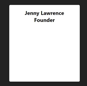
Firstly, the * styling is used to remove default styling applied by browsers. For the body, we specified a height, used CSS Grid to place the card right in the middle of the browser’s page, and added a background colour. We then specified the dimensions for the card, set a background, rounded its corners, added some box shadow, and positioned it relatively. Additionally, a background and a transition property were set on the img-box container. Finally, a fixed height was set on the details container, and its text was aligned to the center.
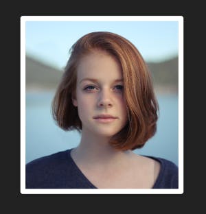
Adding the last piece of HTML: an image
<div class="img-box">
    <img src="./sample.jpg" alt="Sample image" />
</div>
Then adding a little more CSS:
.img-box {
  position: absolute;
  top: 10px;
  left: 10px;
  right: 10px;
  bottom: 10px;
  z-index: 2;
}

.details {
  position: absolute;
  left: 10px;
  right: 10px;
  bottom: 10px;
}

img {
  width: 100%;
  height: 100%;
  object-fit: cover;
}
Let’s first go over what we just did.
We first positioned the img-box element absolutely, which tethered it to its relative parent element (card). We then used position offset values to move it 10px from every direction, which produces the white border-like effect.
We also absolutely positioned the details element, but we can't see it only due to the higher z-index of the img-box element sitting over the details element. Then we spanned the image to its parent container's full width/height. Finally, we used the object-fit property to control how the image is resized to fit its container (trust me, this would be useful later).
And now, we have a cool looking card:
To finally get our desired effect, we add the following styles:
h2 {
color: #777;
text-transform: uppercase;
font-weight: 400px;
}
span {
font-size: 16px;
font-weight: 500;
color: #f38695;
}
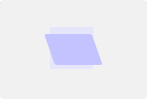
.card:before {
content: "";
position: absolute;
top: 0;
left: 0;
width: 100%;
height: 100%;
border-radius: 5px;
background: #fff;
transition: all, ease-in, 0.5s;
z-index: -1;
}
.card::after {
content: "";
position: absolute;
top: 0;
left: 0;
width: 100%;
height: 100%;
border-radius: 5px;
background: #fff;
Transition: all, ease-in, 0.5s;
z-index: -2;
}
.card:hover::before {
transform: rotate(20deg);
box-shadow: 0 20px 10px rgba(0, 0, 0, 0.2);
}
.card:hover::after {
transform: rotate(10deg);
box-shadow: 0 20px 10px rgba(0, 0, 0, 0.2);
}
.card:hover .img-box {
bottom: 80px;
}
I know what you’re thinking 😅; that’s a handful of code, which is why I’ll go through every critical line with you. We created two pseudo-elements ::before and ::after and positioned them absolutely to their relative parent element. We styled their width and height, and gave them varying z-indexes to create the effect of stacking them on each other. Then we added a transition animation which made them rotate at slightly different angles and activated the animation on hover of their parent. Finally, on hover, we increased the bottom offset of the image container, which allows the text in the details container to be smoothly revealed.
Thus, producing this masterpiece!

Source Code (Code Pen)
Conclusion
Congratulations on making it to the end of the article. As you’ve seen, the ::before and ::after pseudo-elements can be applied in several ways to create some mesmerizing effects.
Feel free to play around with these elements and create your own custom designs and test your level of imagination.